The most important QR code best practices are to use a dark pattern on a light background, preserve the quiet zone, avoid distorting the code, choose a size appropriate for the scanning distance, and test on multiple devices before and after printing the code.
A reliable QR code should also link directly to a secure, mobile-friendly page and include a clear call to action that explains what users will receive after scanning.
Choose static or dynamic QR based on the use case.
Link directly to the intended content. It should be mobile-friendly.
Generate separate QR codes for each placement.
Pick the correct error-correction level for the environment.
Designing
Use high contrast between the code and the background.
Keep the four-module quiet zone clear.
Avoid covering the three finder patterns.
Preserve the square aspect ratio.
Printing
Export a sharp image in SVG or high-resolution PNG.
Size the QR code for the scanning distance.
Use a flat, non-reflective material.
Add a clear call-to-action (CTA).
Launching
Test the final physical version on multiple devices.
Maintain the destination through the campaign lifecycle.
Have a fallback URL ready.
Re-test if any changes are made.
How to make a QR code scan? 17 best practices to follow
To ensure a QR code scan goes smoothly, start by understanding its setup, then design, placement, environment, and final destination. Let us walk you through 17 non-negotiable rules for creating reliable QR codes.
1. Understand the difference between static and dynamic QR codes
QR code guidelines before designing involve understanding how static and dynamic QRs differ.
A Static QR code embeds the destination directly in the pattern. Dynamic codes store a short redirect URL and resolve to a destination you edit later.
Here’s how to choose between static and dynamic QR codes, decide whether you’ll need to edit the destination, track scans, or reuse it across campaigns.
Use static codes for:
Wi-Fi credentials
Plain text and contact info
Permanent product IDs where the destination will never change
Use dynamic codes for:
Marketing campaigns
Editable destinations
Scan tracking and analytics
Long-term printed materials where the target might move
One caveat about a claim repeated across the web: dynamic codes don’t prevent pixelation on their own.
What they do is reduce QR code density by using a short URL. Image sharpness is a separate issue driven by export format and resolution.
2. Keep the data density low
Every QR code encodes a string of characters into its module grid. The longer that string, the denser the grid, and the harder the code is to scan on older cameras or at small print sizes.
A short URL produces a light pattern. A long URL packed with tracking parameters produces a denser pattern with smaller modules.
Two habits keep the encoded string short: use a dynamic QR code so the payload is a short redirect URL rather than the long link. And attach your campaign tracking parameters through the QR platform’s UTM manager, not by pasting them into the URL field.
3. Apply the correct error-correction level
QR codes use Reed-Solomon error correction codes, which detect and correct corrupted or missing data, helping devices scan and read QRs even when they’re smudged or damaged.
L (Low): recovers approximately 7% of the code. Best for clean, screen-based use.
M (Medium): recovers approximately 15%. The default for most marketing materials.
Q (Quartile): recovers approximately 25%. Suitable for outdoor QR code signage and product labels.
H (High): recovers approximately 30%. Required when adding a logo or printing on rough surfaces.
Higher levels also mean a denser module grid, which increases the QR code’s physical size for the same content. Pick the lowest level your environment allows, not the highest by default.
4. Use high-contrast QR code colors
One of the most important QR code design best practices is to maintain a high color contrast between the QR code and its background.
According to Web Content Accessibility Guidelines (WCAG) 2.1, aim for a minimum contrast ratio of 4.5:1 between the darkest modules and the surrounding background.
Pastel foregrounds, yellow-on-white, and near-tone combinations fall below this threshold and produce inconsistent scans.
Keep brand color for the frame or the border, not the modules themselves. The same balance guides every design choice; customize a QR code without reducing scannability by keeping brand identity at the edges.
5. Avoid color inversion
Some brand guidelines push toward a dark background: moody packaging, night-mode digital placements, black event materials. Inverting the QR code (light modules on a dark background) breaks scanning on many older phones and slows it on the rest.
Inverting the palette is one of the most common ways to over-customize and end up needing to create a new QR code.
Place the QR code inside a light-colored panel or badge on top of the dark surface instead. The panel restores dark-on-light for the scanner while keeping the dark aesthetic intact.
6. Keep logos within safe limits
Logos help users identify who owns the code. However, overlaying the logo on top will cover part of the pattern.
Two rules keep the code scannable. First, don’t cover the three large finder patterns in the corners or the smaller alignment patterns spaced across larger codes. Both help the scanner lock onto the geometry.
Second, don’t let the logo occupy more than ~25% of the module area, and pair any logo with error-correction level Q or H so the missing data is recoverable.
Lastly, test on both iOS and Android after adding a logo, especially on older phone models with weaker cameras.
If you’re unsure how to incorporate your logo into your code without compromising its functionality, use a reliable QR code generator with logo integration support.
7. Maintain a clear, QR code quiet zone
The quiet zone is the margin around the QR modules that separates them from the background or surrounding graphic elements.
ISO/IEC 18004:2024, the current edition of the international QR code standard, requires that the data modules be surrounded by a quiet zone on all four sides.
Shrink the border, and scanners lose the ability to detect the QR code’s boundaries. Cropping the margins to fit a tight space breaks a once scannable code.
Sample calculation: a QR code with 2-millimeter (mm) modules requires an 8-mm clear margin on every side, per ISO specification.
Test the placement after other design elements are in place, because layout software often encroaches on the quiet zone during export.
8. Consider the environmental setting for the QR code size
Bigger surfaces need bigger codes.
The 10:1 rule helps you choose the correct QR code size. The QR code width should equal about one-tenth of the expected scanning distance.
The QR code size guidelines below give starting points for common use cases:
Use case
Starting size
Test condition
Business card
2 x 2 cm minimum
Scan distance, 15 to 30 cm
Product label
2 to 3 cm
Curvature and glare check
Table tent
3 to 5 cm
Seated diner’s phone reach
Poster
10% of viewing distance
Actual wall placement
Retail banner
30 to 50 cm
Viewer 3 to 5 m away, on foot
Trade show banner
50 cm to 100 cm
Viewer 5 to 10 m away, walking past
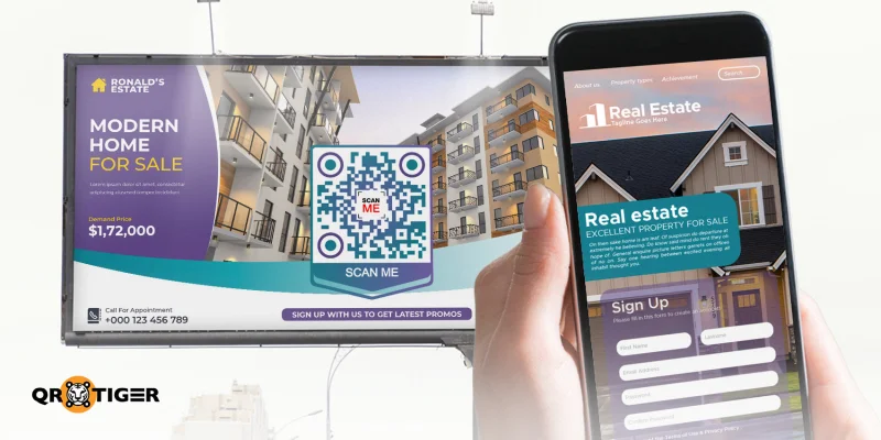
Billboard
60 cm to 100 cm
Storefront, subway, stadium; viewer approaches on foot
Pair the 10:1 rule with a minimum module size of 2mm for print. This keeps the smallest usable QR code carrying a reasonable amount of data at a resolution phones can lock a scan on.
9. Export the QR code in a high-quality format
Use SVG for print designs you might resize later, since vector files scale to any size. Use high-resolution PNG for fixed-sized digital placements.
For PNG, match the image resolution to the final print size at least 300 DPI so the module edges stay sharp.
Avoid JPEG. The lossy compression rounds off the edges of individual modules, and scanners will misread the corrupted pattern. Never enlarge a small raster export by stretching. Regenerate the code at the final size instead.
10. Use a flat, non-reflective printing surface
Glossy coatings and metallic finishes create a reflective surface that bounces light back at the camera. Curved packaging does the same. Rough textures, folds, seams, and stitching distort the pattern.
There are different QR code printing best practices depending on the code’s use. However, one recommendation to avoid problems is to choose a printing material with a matte or satin surface whenever possible.
Curved bottles need a larger code and a higher error-correction level. For fabric or leather, run a real-world sample scan before committing to a large run.
11. Keep the QR code square and undistorted
There are different QR code formats or models, but regardless of the code’s structure, don’t stretch it.
Each module is a square. Stretching the QR image horizontally or vertically changes its geometry, which makes it harder and even impossible for scanners to recognize.
Make sure to lock the aspect ratio of the image container, and verify the final export is still 1:1.
Don’t skew, rotate at odd angles, mirror, or overlay effects like drop shadows bleeding into the modules.
12. Place the QR code where people have time to scan
QR code placement best practices matter more than most designers assume. Position decides whether it ever gets scanned, regardless of how well it’s designed.
Good placements let users stop safely, see the code clearly, and hold their phone steady. Table tops, product packaging, waiting-area posters, printed brochures, seat backs, and stationery displays all work well.
Bad placements include moving vehicles, road signs at driving speed, rotating digital screens, high-traffic doorways where scanning blocks foot flow, and anywhere the user has to strain to reach.
Select the best QR code placement to set the constraints for every design decision earlier in this list: size, error-correction level, and material choice.
Usability research on QR codes consistently points to placement as one of the most common failure modes. Perfect-looking code in the wrong location has the same effect as broken code.
13. Match the call to action to the destination
If the destination is a downloadable guide, the CTA should say “Scan to download the guide,” and the QR code should open the file directly. Not the homepage, signup wall, or unrelated promo.
Every layer of friction between the scan and the promised content lowers your conversion rate.
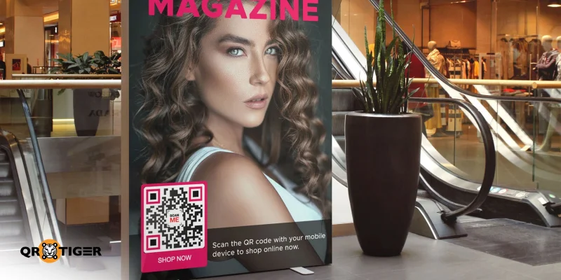
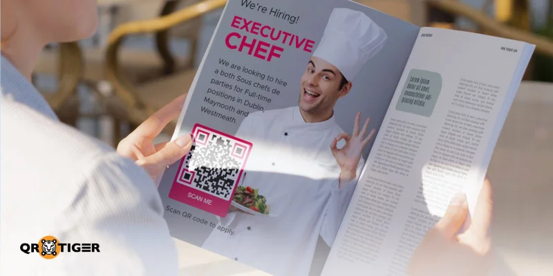
The same logic argues for one QR code per media placement. A magazine ad gets its own QR code, so does the storefront window and the packaging insert.
Separate QR codes let you track which placements drive real scans and which ones you should stop paying for.
Write a clear call to action for every placement, one that names both the action and the payoff:
Scan to view the menu
Scan for 20% off your first order
Scan to register for the event
Scan to watch the installation guide
Scan to verify this product
14. Link to a mobile-friendly destination
Most people scan QR codes using their smartphones.
The destination should therefore load quickly, be formatted for small screens, and skip anything that requires a mouse or a large viewport.
Google’s research with SOASTA shows that the bounce probability on a mobile page increases by 32% as load time increases from 1 to 3 seconds. Push it to 10 seconds, and the bounce probability rises by 123%.
Send users straight to the promised mobile landing page, not the homepage or a generic marketing landing page that requires two more taps to reach the offer.
For forms, keep it short, buttons thumb-sized, and the primary action visible before any scrolling.
15. Add a fallback URL and maintain the destination
Every QR code depends on a working redirect.
If your subscription lapses, the domain expires, or the destination page is deleted, the printed code becomes unusable. Two protections help.
Publish the fallback URL near the code in small print. This gives users with a broken scan a path forward and gives users who use screen readers or non-camera devices an alternative way in.
Put the destination on your regular content maintenance calendar. Broken campaign pages 18 months after launch are one of the most common QR code failures I see in support tickets.
16. Design for accessibility
QR codes make quick access easier for most users. For users with disabilities, adding friction to a printed URL or contact number wouldn't.
Three adjustments are needed to ensure QR code scanability:
Add descriptive alt text to any QR code image on a webpage or email. "QR code linking to the spring registration page" is enough. "QR code" alone isn't.
Place physical codes at a reachable height. ADA-compliant kiosk guidelines suggest 90 to 130 cm from the floor for most public placements.
Make the destination page accessible. WCAG-compliant contrast, keyboard navigation, and screen-reader compatibility on the landing page matter more than any design decision on the code itself.
17. Test the final version in real conditions
QR code testing is important not only after printing the code but also when deploying it.
A code scanning cleanly on your monitor is not the same as a code scanning cleanly on printed matte cardstock in a dim event hall. Test the exported file on real hardware after every change to layout, size, or material.
Log which combinations work on the first try. If any combo fails, fix the design before approving the run, not after.
Work through this scan testing checklist before the QR code campaign goes to live:
Devices
iPhone (current and one older model)
Android (current and one older model)
One older device with a weaker camera
Native camera app and built-in scanner on each phone, not a third-party scanner app.
Conditions
Bright natural light
Warm indoor lighting
Low-light or dim setting
Straight-on and angled scans (up to 30 degrees)
Physical
Final print size on the final material
Curved or textured surfaces where relevant
Printed proof, not a screen mockup
Scan time
Under 2 seconds in bright light on a current-generation phone
Under 4 seconds in warm indoor light on a current-generation phone
Under 6 seconds in low light or on an older device
No repeated failed scans before recognition (a code that scans on the third attempt is a failed test)
Consistent across straight-on and angled scans
Destination
Final URL loads on mobile
Page loads in under 3 seconds on a mid-range network
Fallback URL works if the primary link fails
Analytics parameters fire correctly
Retest after any layout, export, or production change. A code scan fine last week won't necessarily be fixed after your printer changes its ink calibration.
Security considerations
A QR code is a delivery mechanism, and the same properties that make it useful for marketers also make it useful for attackers. The scam has a name now: quishing.
Three habits protect your QR codes and the people who scan them:
Make sure the destination URL shown near the code matches the domain of the brand or campaign it's associated with. Mismatched domains are the first sign of tampering.
Use HTTPS for every asset the destination loads, since a single mixed-content warning can kill trust across the whole campaign.
Monitor placement in public spaces for stickers overlaid on the original, and watch scan-tracking dashboards for unusual traffic patterns.
Our team ran a controlled scan test to see how design variables affect real scanning behavior.
We tested printed QR codes on an iPhone 13 and an Android POCO device under both natural and fluorescent lighting, and using both the native camera and built-in scanner.
Important: On iOS, the built-in scanner opens the destination automatically, which is convenient but leaves users vulnerable to QR phishing since they can’t verify the URL first.
Scanning range depends on size, method, and device
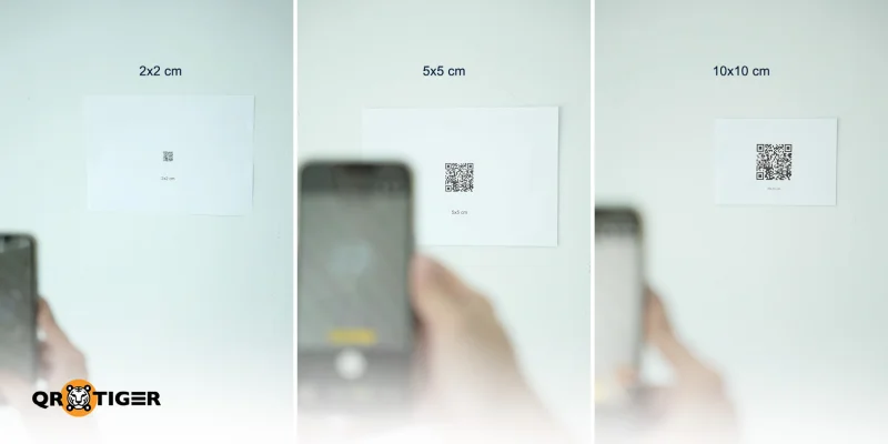
(From left to right) An iPhone 13 scanning QR codes with sizes of 2x2 cm, 5x5 cm, and 10x10 cm
A 2 x 2 cm QR code scanned differently depending on the device and scanner.
With the iPhone’s built-in camera, it scanned from 30 cm away, while the Android camera failed at that distance. Using the phones’ built-in QR scanners, the iPhone reached 90 cm, and the Android reached 85 cm.
At 5 x 5 cm, the QR code was scanned from 92 cm on an iPhone and 55 cm on an Android using the camera. With the built-in QR scanners, both devices reached 234 cm.
At 10 x 10 cm, the camera range increased to 195 cm on iPhone and 118 cm on Android. The built-in scanner reached 473 cm on both devices, the maximum distance available in the test area.
Since scanner performance can vary significantly across devices, scanning methods (e.g., tilt), and lighting conditions, test your QR code under these conditions before publishing.
Low contrast breaks native cameras first
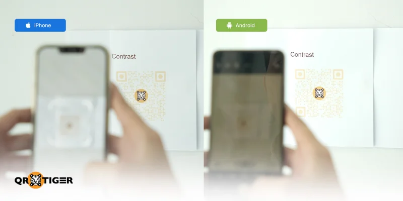
(From left to right) An iPhone and Android scanning a low-contrast QR code
A low-contrast QR code failed on both iPhone and Android native cameras at arm’s length. Only the built-in iOS scanner could still read it.
Native cameras use faster, less forgiving image processing than the built-in scanner. That’s a design constraint, not a phone limitation.
Since most users do not use the built-in scanner or a third-party app, contrast must meet the WCAG 4.5:1 threshold, or half your audience will never reach the destination.
Android is stricter on quiet zones
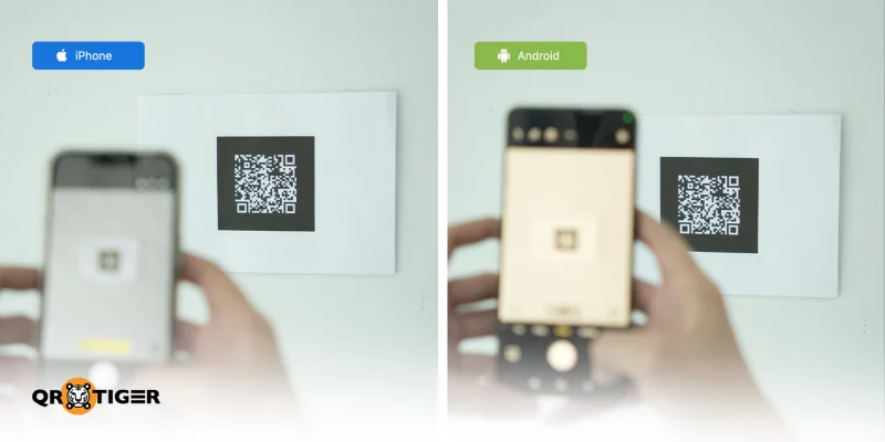
(From left to right) An iPhone and Android scanning a QR code with a minimal quiet zone
At 10 x 10 cm QR code with no quiet zone was still scanned on the iPhone. The same QR code failed to be scanned by the Android device’s camera and built-in scanner.
This is one of the more consequential findings for cross-platform campaigns. A designer testing exclusively on iPhone sees a working QR code; Android users see a broken one.
Corner wrapping break scans regardless of the device
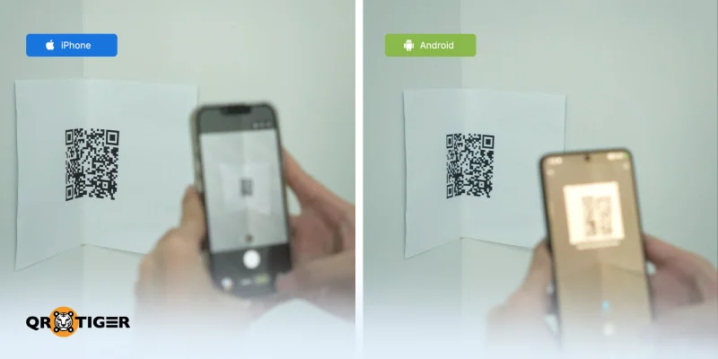
(From left to right) An iPhone and Android scanning a QR code wrapped around a wall corner
A 10 x 10 cm QR code placed on a corner failed to scan on both iPhone and Android devices’ native cameras and built-in scanners.
Curvature distorts the module geometry from the scanner's angle of view. No error-correction level compensates for that distortion.
For bottles, columns, or wrapped packaging, plan on a code at least 30% larger than a flat-surface equivalent.
Vector scans more reliably than scaled-up or compressed raster exports
A QR code exported as SVG and printed at multiple sizes read cleanly on the first try. A JPEG version of the same QR code was still scanned, but scan times were noticeably longer on both iPhone and Android.
The lossy compression rounds off the module edges just enough for the scanner to fight the pattern before locking it.
In print, that extra second of scan time is what separates a user who completes the scan from one who gives up and walks away.
Good and bad QR code examples
Take a look at these do’s and don’ts in QR code designing and placement to learn how to fix a QR code that does not scan or that no one scans.
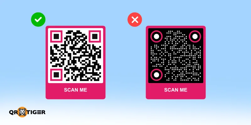
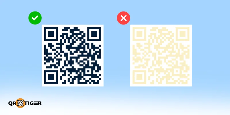
Good versus poor contrast
✅ Using dark modules on a light background makes the QR code easier for scanners to detect. The strong contrast creates a clear pattern that helps devices scan the code quickly and reliably.
❌ Using low-contrast color combinations such as pastels, yellow on white, or similar brand colors for the QR modules and background.
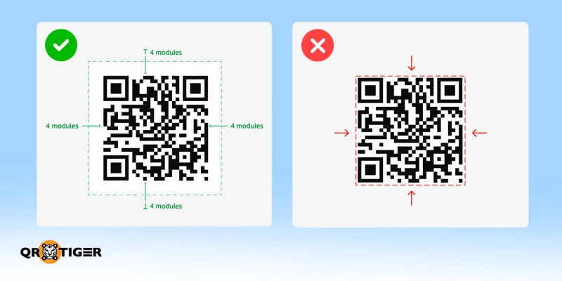
Correct versus cropped quiet zone
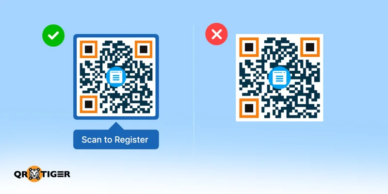
✅ Keep a four-module clear margin on all four sides of the QR code. This quiet zone helps scanners detect where the code starts and ends, improving scan reliability across devices and platforms.
❌ Cropping the margin (quiet zone) or crowding it with text, logos, and image edges.
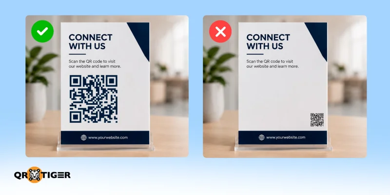
Correct versus undersized code for a specific scanning distance
✅ The QR code is sized based on the 10:1 rule, like width equal to about one-tenth of the expected distance.
❌ Disregarding both the QR code size and the viewing distance. A 2 x 2 cm QR code is fine at a handheld distance, but breaks the moment they pull back.
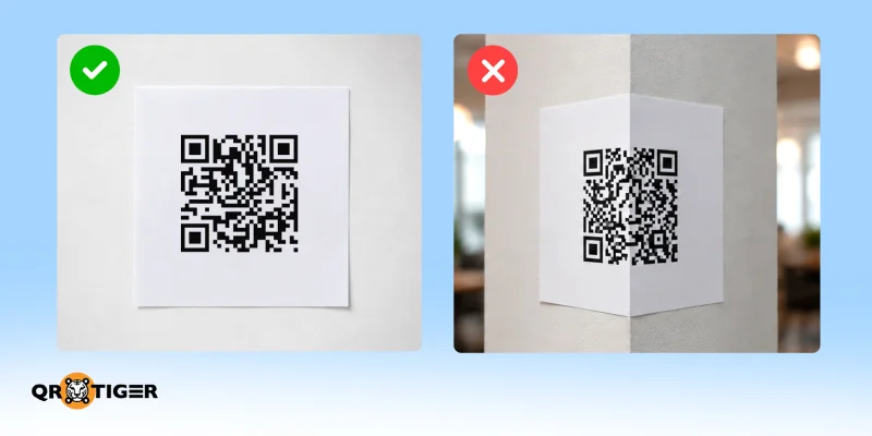
Flat versus wrapped or curved placement
✅ Placing the QR code on a flat, non-reflective surface allows cameras and built-in scanners to lock the pattern’s geometry and read it normally.
❌ Wrapping the QR code around the corner of a square pillar distorts the pattern, making it impossible to scan.
Clear CTA versus unexplained code
✅ The call to action, “Scan to register for the event,” lets users know what to do and what happens next.
❌ A QR code printed alone with no explanation of where it leads reduces interest and raises suspicions.
SVG versus blurry raster export
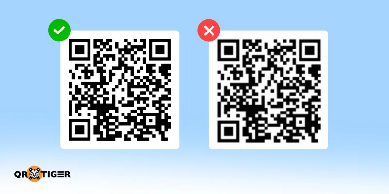
✅ SVG export or high-resolution PNG at 300 DPI for the final print size maintains the sharpness of module edges. The scanner can read the pattern cleanly on the first pass. This export choice survives resizing, printing, and photocopying without softening.
❌ Small PNG scaled up in Photoshop, or a JPEG at any resolution, softens the module edges into blur. The scanner works harder to find the boundary between dark and light.
Questions people keep asking—answered
What is the best practice for QR codes?
The best QR code practice is high contrast on a light background, a four-module quiet zone, a size matched to scanning distance, and a clear call to action linking to a mobile-friendly page.
What are common QR code mistakes to avoid?
The most common QR code mistakes are inverted colors, a cropped quiet zone, low-quality JPEG exports, oversized logos, undersized QR codes, and linking to a desktop-only page.
What do the 3 squares on a QR code mean?
The three large corner squares are called finder patterns. They tell a scanner the QR code's orientation, alignment, and scale.
What format is best for a QR code?
SVG works best for print, since vector files stay sharp at any dimension. Use PNG for fixed-size digital placements.
What is the minimum size for a QR code?
The minimum reliable QR code print size is 2 x 2 cm on most smartphones. Keep individual modules at 2mm or larger, and follow the 10:1 rule.
Which error-correction level should you use?
Level M works as the default for indoor marketing. Choose Level Q or H for outdoor signage, packaging, or codes with a logo. Level L is fine for screen-only codes with a lot of data and no logo.
The next QR code you print should scan on every try
Seventeen rules are a lot to hold in your head at once. If you remember only three of them, they should be: high contrast, the four-module quiet zone, and a proof scan of the final material with a real phone.
Skip one, and the print run turns into an expensive lesson. Nail all three and you've cleared the bar most QR code campaigns fail at.
Want a QR code scanning every time? Create and test your QR code with QR TIGER.
Disclaimer
This article is for general informational purposes only and does not constitute legal, financial, or other professional advice. For questions about QR TIGER's products or services, please contact our support team at [email protected].
Frequently Asked Questions (FAQ)
What is the best practice for QR codes?+
The best QR code practice is high contrast on a light background, a four-module quiet zone, a size matched to scanning distance, and a clear call to action linking to a mobile-friendly page.
What are common QR code mistakes to avoid?+
The most common QR code mistakes are inverted colors, a cropped quiet zone, low-quality JPEG exports, oversized logos, undersized QR codes, and linking to a desktop-only page.
What do the 3 squares on a QR code mean?+
The three large corner squares are called finder patterns. They tell a scanner the QR code's orientation, alignment, and scale.
What format is best for a QR code?+
SVG works best for print, since vector files stay sharp at any dimension. Use PNG for fixed-size digital placements.
What is the minimum size for a QR code?+
The minimum reliable QR code print size is 2 x 2 cm on most smartphones. Keep individual modules at 2mm or larger, and follow the 10:1 rule.
Was this article helpful?
Enterprise Ready
Maximize Scans with the Best QR Code Generator
Join thousands of global brands using QR TIGER to manage dynamic routing, bulk creation, and deep attribution analytics.
Vall, Head of Content, has 5+ years of experience in digital marketing and 8+ years in journalism. With an AB Mass Communication degree, she writes content on marketing and innovations. Her extensive QR code knowledge helps businesses maximize their potential in modern marketing and operations.

 By Vall V.